 English
 Deutsch
 Français
 Italiano
 日本語
日本語 Español
 Português
 Russian
 Chinese (Simp.)
 捷克文
捷克文 Polish (Store only)
LaserSoft Imaging's SilverFast Ai 6 scanning software has different levels of image correction. Global colour correction and selective colour correction are two of the most useful tools to correct an image even before it is scanned in its final form.
The fifth icon from the left on the SilverFast Toolbar -the coloured circle- will open the Global Colour Correction dialogue window. This tool gives you access to SilverFast's colour balance algorithm, and resembles changing the colour balance in a dark room somewhat. The Global Colour Correction dialogue is one of the most powerful tools to get rid of photograph discoloration from ageing. The top of the dialogue window represents a gradation curve. Gradation refers to the relationship between input and output . In the Global Colour Correction dialogue, the actual gradation curve is overlaid in the dialogue window to show you how the curve changes in relation to the changes you apply during global correction.
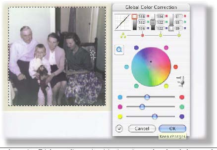
Next to the gradation curve, there are three tonal value sliders. From left to right: the shadow areas, the mid tones, and the highlights. Right below these sliders are selection dots. You can apply the global correction changes on either all tonal values in the photograph -by clicking the three dots at left- or only to one of the three areas by clicking on a dot right below the desired tonal value indicator.
The dots that are selected will turn red. A red square will appear around the tonal value indicator that is active. Besides the correction wheel is a small slider that will set the degree of change. I always leave this set to its default, which is medium. Only when changes result in a drastic colour shift in the photograph, will I set this to the smallest degree of change. I never use the maximum setting, because I find that too easy to overshoot my objective.
Global Colour Correction comes after white / black point setting, so our test photograph was already somewhat corrected, but it turned out much too dark and the colour cast was still there. I decided to use Global Colour Correction because it gives you much control over what happens, and it works intuitively as you move either the centre dot on the colour wheel or the sliders beneath the wheel. Personally, I prefer moving around the dot in the colour wheel as this gives me instantaneous feedback as to which colours I'm moving the balance to.
Fine-tuning colour correction
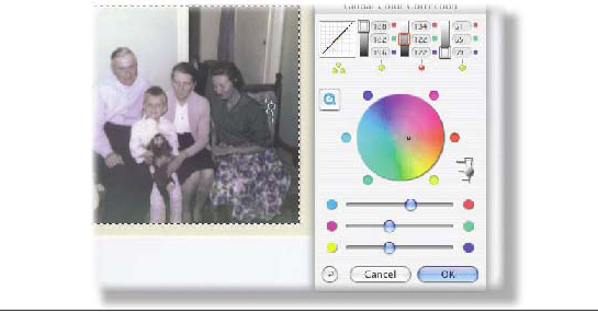
When I want to fine-tune my dragging behaviour, I click on the coloured dots on the circle's edge. This makes the dot move in smaller increments. If you are unhappy with the results after some intense dragging and changing, the reset button at bottom left will reset the image and the dialogue window to their default state.
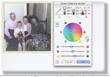
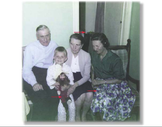
The test image looks better than when we started, but it still doesn't look perfect. Nevertheless, we could leave it at that if we wanted to. The image is corrected and looks back more or less to what it must have looked like when the picture was taken. To show you that it does fall within the limits of what you can expect, I've added the corrected photograph hereafter with three arrows pointing out three areas of concern.
The top arrow points to a bowl of apples in the photograph. The apples look definitely their natural, green colour. The young woman's skirt had a blue and green design. This looks quite OK as well. But the arrow pointing to the puppet shows the red is nearly not red enough. We should still tackle this concern.
(Source: IT-Enquirer)